Introduction
To build a successful marketing landing page it’s important to consider the user experience and make sure it is as effective and appealing as possible. Here are some tips to help you design an effective landing page for your product or SaaS.
Hero Section
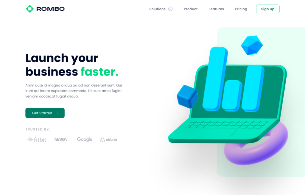
The hero section is the first thing visitors witness when they arrive at your landing page, and it should be designed in a way that captures the attention of users right away. It should include a headline that catches the eye of the viewer, a short description that explains the purpose of the product, and a relevant image that conveys the message of the product. Additionally, it is important to make sure that the hero section is optimized for mobile devices, as more and more people are using their phones to access websites. This ensures that your landing page will look great on any device, and that the hero section will be the first thing visitors see.
A great way to make a good first impression is by using professional eye-catchy 3D icons. You can use Glaze 3D icons to build complex illustrations not only for your website hero, but also for other website sections, blog covers and social media. You can customize their colors to match your brand and use them to elevate your visual communication.
Product benefits
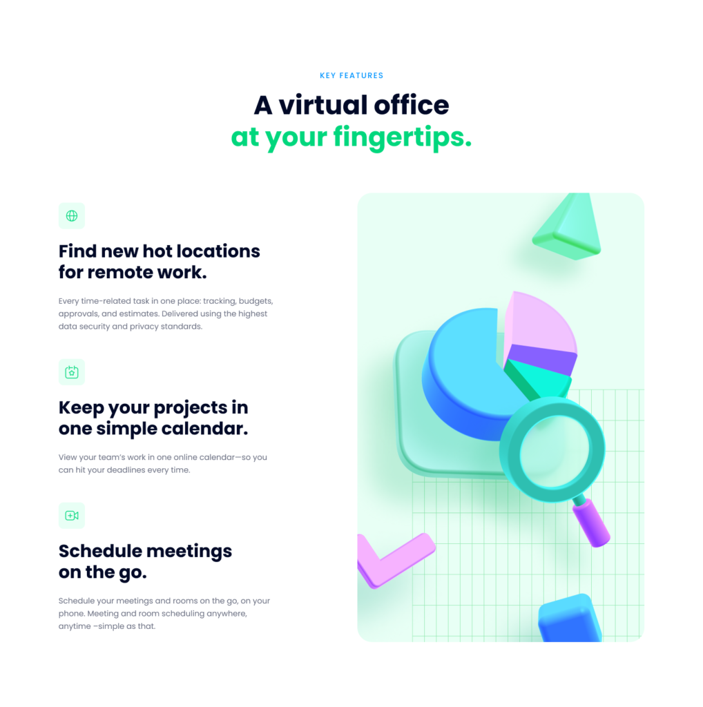
Now that you introduced your product or service in the hero section, it’s time to offer your users some more details about it. So the purpose of the next section should be to highlight the main benefits that the user will experience when using your product. Ask yourself what value will it add. Will it save the user’s time? Will it make it easier to accomplish complex tasks? Will your product offer more freedom or flexibility to your users? A great idea is to reinforce these benefits visually, by using icons or illustrations. This way, the benefits will be easier to remember and will make your landing page look more exciting and professional.

Proof of Trust
Trust is an important factor when it comes to making a purchase online. Including visual proof of trust, such as customer logos or a trust seal on your website, can help build user confidence while increasing conversions. This is because customers feel more secure when they can see that others have successfully used the product or service, and are more likely to complete their purchase. In addition, having a trust seal on your website can also give customers a feeling of safety and assurance that their data and personal information is being protected. Therefore, incorporating proof of trust into your website can be an effective way to give customers the confidence they need to make a purchase.
Testimonials
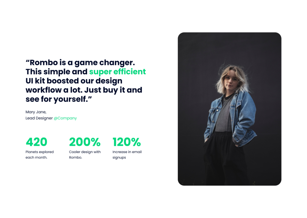
Adding customer testimonials to your landing page is an excellent way to make your visitors relate to another human being that used your product. Testimonials from existing customers act as a form of social proof, which can convince visitors that your product is the right choice and it’s actually addressing the same pain they have. Not only that, but customer testimonials can also highlight certain features of your product or services. Pro tip: usually 3 testimonials are enough to build trust, you don’t need a lot of them to prove your product or service is adding value to people’s lives.
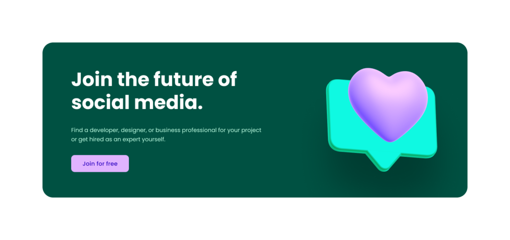
Call to Action
A clear and prominent call to action is essential for a successful landing page. Make sure it stands out from the rest of the page by making it more interesting visually through the use of color or illustrations.
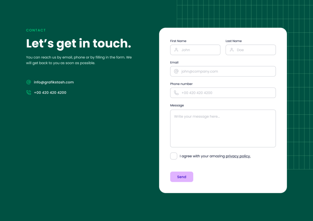
Contact Section
Include a contact section that is easy for users to find. This should include your contact details and a form where users can submit any questions about the product or service. If possible, make sure to include an email address, phone number or WhatsApp number so the users can’t miss the opportunity of getting in touch.
Get Rombo UI kit and start creating your website
All these sections and many more are included in Rombo UI Kit, a super simple-to-use Figma file for building marketing websites. This UI kit includes all the elements needed for a website that converts visitors into customers while following all the design trends so your brand can have a professional look online. With 18 different sections and 23 different templates, you can design your marketing landing page in minutes, not days.
Conclusion
By following these tips you can design a successful marketing landing page for your product or SaaS. Think about how you want the user to interact with the page and what you want to achieve with the landing page. Consider the user flow and how you want to direct the user to the desired action. Keep the design clean, simple, and intuitive so that users can easily find the information they need. Also, be sure to use imagery and visuals to draw users in and make sure that the landing page’s content is clear and concise. Have fun creating!

